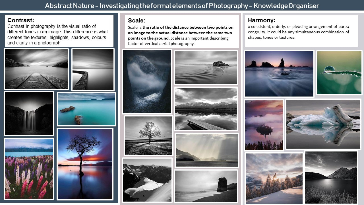
Abstract Nature: Personal Project 1

Abstract Nature: What is Abstraction?
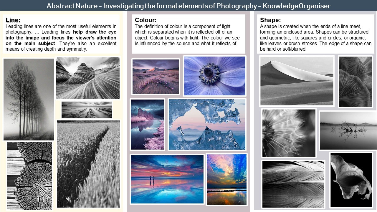
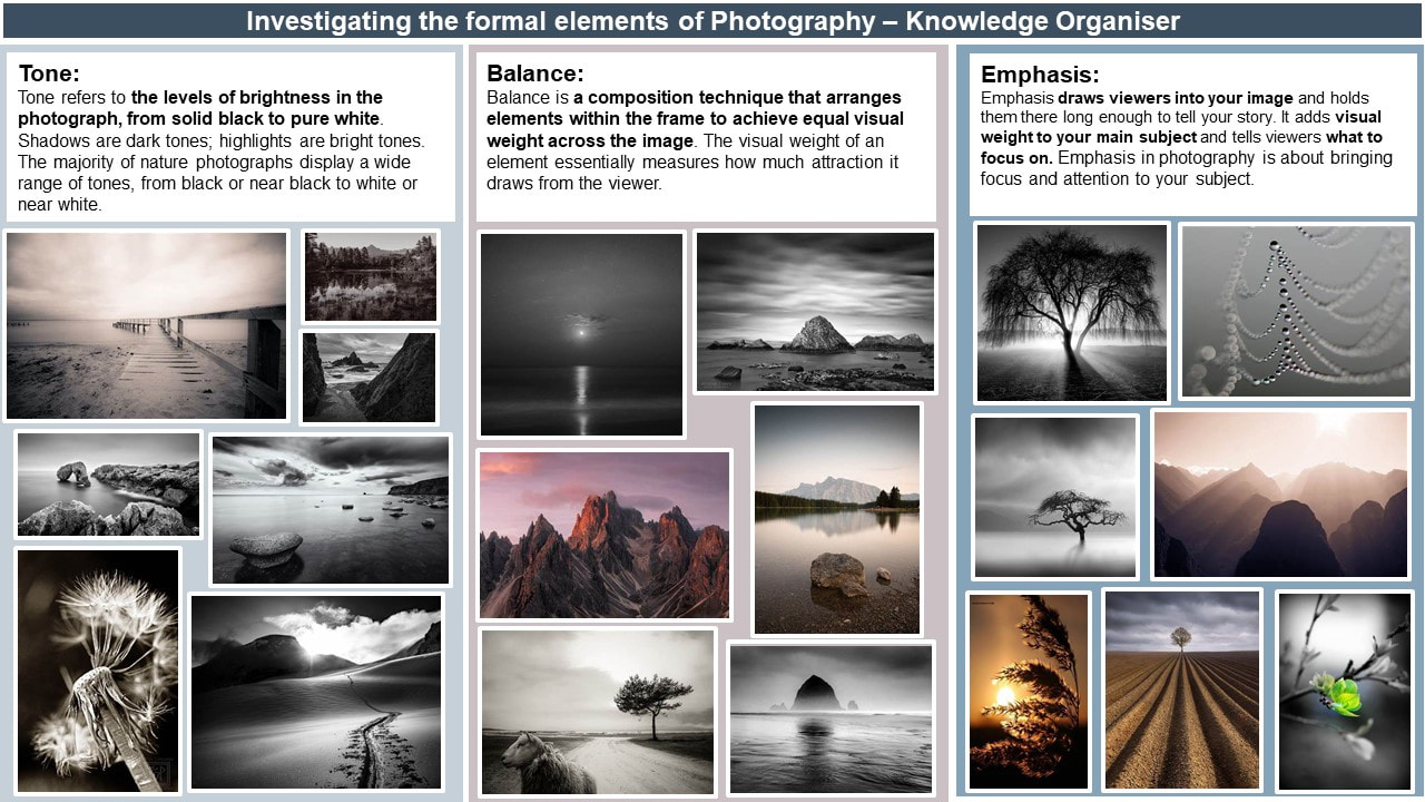
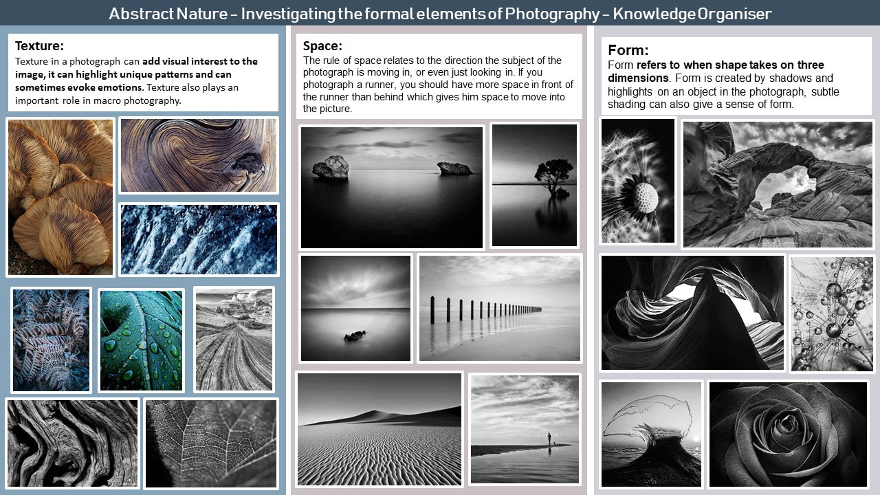
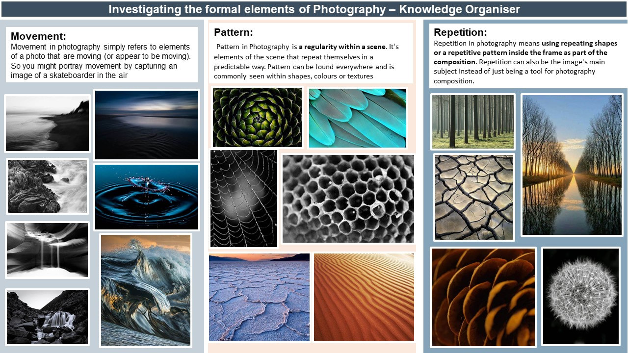
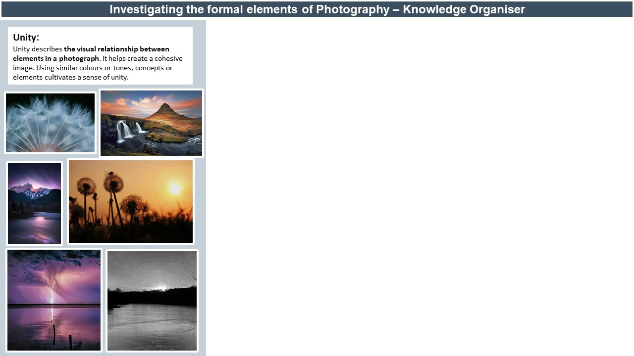
Abstract photography consists of images created using photography materials and equipment that aren't instantly recognisable or associated with the physical world. Abstract photographers use perspective, movement, and light to transform the world we see into an unexpected, often unrecognizable image. Below are some examples that I am drawn to and am inspired by and some initial research into the formal elements of photography


Abstract Nature: INVESTIGATION OF ABSTRACT PHOTOGRAPHY TECHNIQUES
Monochromatic Photography


Monochrome photography is photography where each part of the image shows different levels of colour due to light and shadows. It includes all forms of black-and-white photography, which produce images containing shades of grey ranging from black to white.
Example Images:


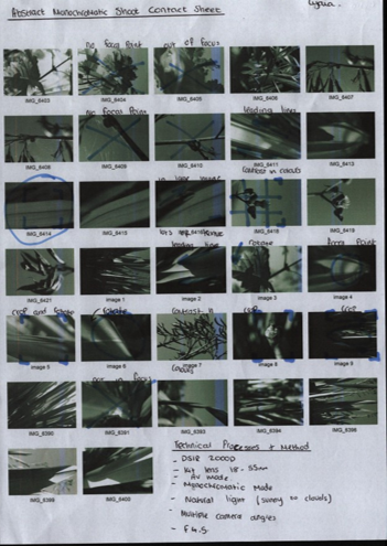
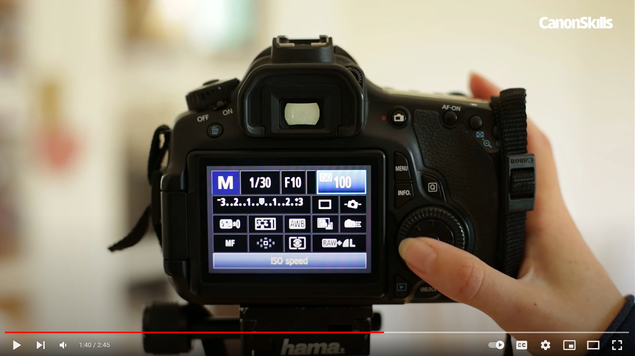
For my abstract nature monochromatic shoot, I used a canon DSLR 2000D with a standard kit lens (18-55mm). To achieve this shoot, we used aperture priority mode (AV or AP) on a low f stop. With my camera I set the aperture setting to the lowest f stop which was f/4.5 this meant that I could achieve a shallow depth of field. On the day of the shoot, we used natural light which was very bright as the sun was out and there were little to no clouds this meant that our iso would need to be lower than it would need to be if we were shooting indoors with artificial light.
I enjoyed doing the monochromatic shoot because I love how the light can change the tones in the image. I think I managed to capture some abstract images and I managed to capture textures in the different leaves. I think to improve my photos next time I could experiment with more camera angles and to zoom in more on objects to make them appear more abstract.
I enjoyed doing the monochromatic shoot because I love how the light can change the tones in the image. I think I managed to capture some abstract images and I managed to capture textures in the different leaves. I think to improve my photos next time I could experiment with more camera angles and to zoom in more on objects to make them appear more abstract.
Abstract Nature: ICM - Intentional Camera Movement Shoot
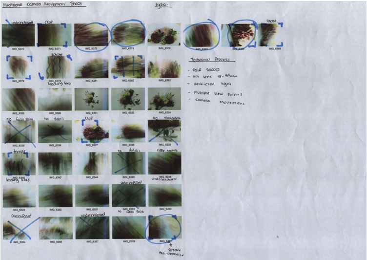


The idea behind Intentional Camera Movement or ICM photography is to add the illusion of movement to a still image. Long exposure is crucial for this technique since it creates a lot of motion blur.
Example Images:


In this shoot I used a canon DSLR 2000D camera, with a standard kit lens (18-55mm). To capture the motion blur, we used shutter priority mode (SP). We used a slow shutter speed, so the camera lens stayed open which enabled us to capture the motion blur. I used a 1 second shutter speed in my shoot. Finally, when taking the photos, I spun my camera in different directions to create different effects withing the image.
If I were to do the shoot again, I might use more flowers in contrasting colours to create more contrast in my images. Additionally, I could also try different vantage points taking my images. However, in my images I like the lines that have been created with the blur effect.
If I were to do the shoot again, I might use more flowers in contrasting colours to create more contrast in my images. Additionally, I could also try different vantage points taking my images. However, in my images I like the lines that have been created with the blur effect.
Abstract Nature: SHALLOW DEPTH OF FIELD


Shallow depth of field allows the photographer to get a really crisp and clear image on a main subject with a blurry background (shallow depth of field) this makes the subject stand out and separate from the background. This is achieved by using a low f stop.
Example Images:


In this shoot I used my canon DSLR 2000D with the standard kit lens (18-55mm). In this shoot I used aperture priority mode with an f stop of f/4.5. In all of these images I used natural light, the weather was bright but slightly overcast therefore some of the images from my shoot are slightly underexposed. I experimented with different viewpoints such as close up, Arial and eye level.
If I was to do this shoot again, I would try and pay more attention to the composition of my images and the lighting. I would try and make sure that the lighting was the best that it could be. I think that my images show lots of detail.
If I was to do this shoot again, I would try and pay more attention to the composition of my images and the lighting. I would try and make sure that the lighting was the best that it could be. I think that my images show lots of detail.
Monochromatic shoot: final edits


|
I have chosen this image as my first image because I really like the contrast in light and dark within the image. I like the shadows that the sun has cast which helps to create tones within the image. To edit this image, I have increased the contrast and brightness, and I have increased the sharpness and clarity. I have also increased the highlights within the image and made the shadows more pronounced.
For my second image I have picked this image because I like how the focal point is in the centre of the image and fir the most part how it is symmetrical. I love the detailing that the camera has picked up and that stands out more after the final editing process. I also like the fact that each time you look at the image something else catches your eye. during my editing process I cropped my images to make it central, I have also increased the contrast to separate the subject from the background. finally, I increased the sharpness of the image making sure not to increase it to the point where it became grainy.
I chose this image of my third image because I like how it cuts straight through the image and is quite dominating in the image. I like how your eyes is drawn to the middle by the leading line wrapping around the unfolding leaf. during the editing process I cropped this image to make this the focal point of the image and to crop to the most detailed part of the image. I increased the sharpness and I also increased the contrast.
I chose this image as my fourth image because I love the shadow that the light casts on the leaf this image is my favorite image out of the four images. I love this image due to the contrast in light and dark and I love the way the shadow highlights parts of the image. I like how the light cuts straight through all thirds of the image. To enhance my image, I edited it so that there was a high contrast in light and dark and so that the sharpness of the details in the leaf were also highlighted.
|


Artist Investigation / Edward Weston
"Why limit yourself to what your eyes see when you have an opportunity to extend your vision?" 
Why this video?
I chose this videos because I think that it illustrates how versatile Edward Weston was in his industry. I also think it captures how detailed his images were in his time. |
Why this artist?
To begin my artist investigations I will initially study the work of Edward Weston due to his work relating to natural forms and abstract photography and his use of monochromatic photography to provide tone and depth in an image. Who is he? Edward Weston was born in 1886 and is well know within the industry for being "one of the most innovative and influential American photographers " over the course of his 40 year career he photographed a variety of different subjects including landscapes, still-life, portraits and more. Why this quote? I chose this inspirational quote by Edward Weston because I think it captures the essence of why many people partake in photography I also think it is encouraging and motivating to go out and see what you can find. I also think that the quote sums up Weston's work due to the vast amount of different subject that he captured. |
Below are a selection of 10 Weston images that are inspirational to me because I like the detail that the black and white picks up and the shadows and contrast between the different images.


SEMI analysis / Edward Weston
|
SUBJECT:
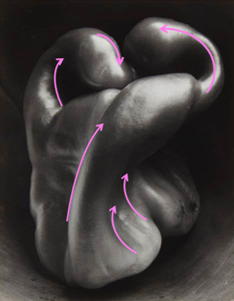
My chosen photographer is called Edward Weston. The title of this photograph is pepper no. 30 1930. the genre of this photograph is still life monochromatic photography. In the image I can see is a pepper on a surface that frames the mage and adds a vignette effect. ELEMENT: The photographer uses the seven visual elements of art in his work to create this photograph. In my opinion the strongest elements are line, shape and tone. Weston has shown line successfully in his work by using leading lines which lead the viewers eye to the main focal point of the image. He has also demonstrated shape by the different ways the shadows have been cast across the pepper this is exaggerated by the use of monochromatic photography which helps to show tone. He has shown tone by using natural light to create shadows, Weston then uses black and white photography which further increases the contrast between the shadows. MEDIA: The main focal point of the image is the top of the pepper I think this because the lines in the image draw the viewers eye to the top part of the image these lines are called leading lines. The pepper has been placed in the centre of the image and is framed by a dark vignette effect. I believe the photos was taken using natural light which helps to highlight thee key features of the object. I can see that the light is coming from the right upper hand side of the image this makes the lower right hand side of the image dark and shadowy with little contrast in colour. INTENT: I feel the image gives the effect of a moody and dark feeling. I also feel that the image has a cold undertone to it. I think this because of how light and dark the image is. The amount of darkness outweighs the amount of lightness this creates a dark and ominous tone in the simple way Weston has chosen the colours and contrast within the image. When I take my own photographs I will try to emulate this by using monochromatic photography and by having a high contrast between black and white. I will also try to create highlights and shadows. |

Pepper no.30 1930
|


|

|

|
Technical Processes/ Low Key Photography

|
With low key photography, lighting is reduced in order to produce images with striking contrasts, dark tones, and shadows. Usually, a single source of lighting is used to produce this composition.
As a result, low key images often have a dark dramatic tone to them. In low key photography we let shadows fade into black. It makes our images appear dark, mysterious, and moody. |
Shoot Plan / Edward Weston

|
Edward Weston has inspired me to do this abstract shoot because the link between his still life images and our abstract nature module helps us experiment with another way in which we can take photos in our abstract nature module. The detail that he manages to capture I his images also inspires me with the contrast between light and dark. I will do my shoot in our weekly photography lessons in school in the morning. Doing this shoot indoor s and with natural lighting can influence my shoot due to how much natural light there is in the room additionally the weather will also influence my shoot depending on weather it is cloudy and lacking light which might result in images becoming underexposed or if it is sunny and bright light this could cause the images to be over exposed. However this could also lead to shadows being cast and highlight the different shapes within the object.
|
To complete our shoot we will use vegetables inside of a plant pot we will use these props to control the amount of light let onto the objects we are photographing. The plant pot will also help to cast different shadows on our vegetables which will hopefully enhance the final product. The plant pot will also act as a frame for the image adding a vignette effect. To block any unwanted light entering the plant pot I will use a piece or cardboard or thick card to block the plant pot drainage hole. I will also use something like books or a tripod to balance my camera on.
The aim of this shoot is to emulate the work or Edward Weston and his examples of low key photography work. to do this we will trying to control the light coming onto our object without using artificial light. During our shoot we will be using natural light that will cast shadows on our chosen object and create contrasts between the light and dark of the object and hopefully highlight parts of the image.
For this shoot I will be using a Canon DSLR 2000D camera with a kit lens (18-55mm) I intend to use a large aperture of around f.5 and a fast shutter speed to capture the details on my chosen vegetable. I Intend to experiment with the different positions in which my object will be for example I will try it facing toward the light ad then away from the light and I will also try it facing side ways on to the light to see what captures my object the best. I will also be shooting with a low ISO of around 400.
EDWARD WESTON SHOOT: Final Edits


|

For this image i firstly opened my image in my chosen editing software which was pixlr-e. Firstly I opened up the brightness and contrast and adjusted the brightness so that the highlighted areas where the light hit the pepper was lighter. Then I increased the contrast which made the light hitting the pepper stand out. Then I increased the shadows making more contrast between light and dark in the image. Once I was happy with the contrast I increased the highlighted areas making them more of a luminous white. Once I had finished adjusting the colours I moved onto sharpening my image so that the smaller details of the pepper, such as the wrinkled skin was slightly more noticeable. I then increased the clarity of the image whilst making sure not to make the image to grainy. My final step was putting a vignette around the outside of the image to draw more attention the main part of the image. |


|

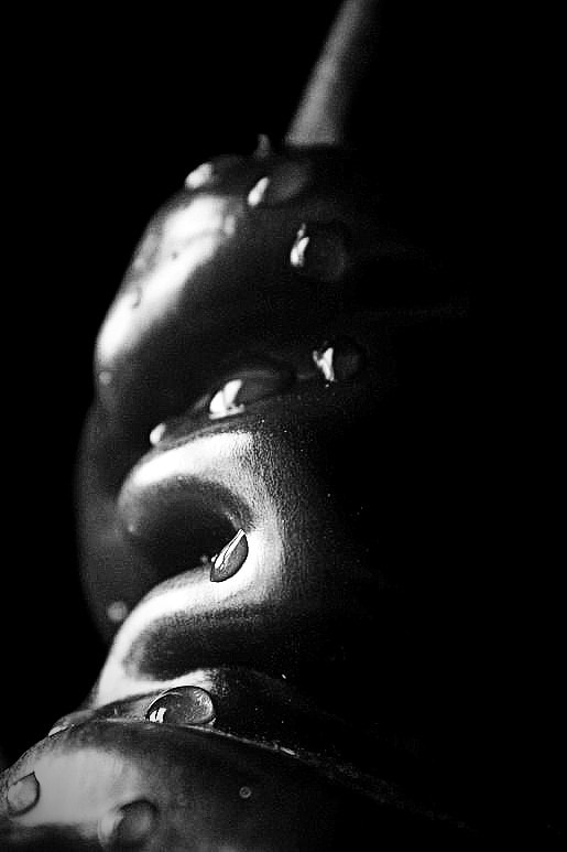
In this image i used a chilli pepper I chose this pepper because of its different shapes. to get the water droplets i used a pipette and placed drops of water along the pepper. In this image i like the contrast between light and dark and the different patterns created. to edit it i increased the contrast and adjusted the brightness so that the image wasn't underexposed. Next i edited the highlights and shadow further increasing the contrast between light and dark. finally i edited the sharpness of the image so that you could see the texture on the pepper.

I think that this image is less abstract than the previous two but i like the texture shown of the peppers skin, I chose this pepper because I thought that the wrinkling on the skin would add an extra detail to the final image. To edit this image i used pixlr i edited the brightness and the contrast and then i edited the highlights so that you could clearly see where the light hit the pepper. Finally I decided to increase the clarity of the image to make sure that you could clearly see the textured skin of the pepper.
|
To capture this image i set the pepper halfway into the plant pot which was beside the window. The plant pot acted as a vignette effects framing the image. I like the different details captured in this image and how the highlights and shadows show the shape of the pepper. I edited this image using pixlr and started by increasing the contrast between light and dark I then edited the highlights so that there was a greater contrast. As my final step I increased the clarity and sharpness so that the details within the image were clearer.

This image looks similar to the previous image, however this was shot at a different angle and position to the image before. I placed the pepper inside the plant pot which created a dark frame for my shot and positioned the pepper side on. When i edited this image i chose to crop it from the original photo i chose to this so that the texture where clearer and in more detail. I edited by increasing the contrast and highlights and then i decided to edit the clarity and sharpness to make the details really stand out.
|
Abstraction through cyanotypes/ Anna Atkins
My 3 Favourite Anna Atkins images:
Modern Cyanotypes:
Artists are still using cyanotypes today they create them by laying their subject directly onto emulsion-covered paper and exposing it to light. they us it as an alternative printing technique, however with the advance in technology this technique is slightly less common and has faded out.
A modern cyanotype artist called Meghann Riepenhoff creates camera less images otherwise known as cyanotypes. she creates these images on the right hand side by draping her emulsion-coated paper along the shoreline, across branches or under snow. her aim is to create abstracts images of landscapes and the ocean. These two images are my favourite because of the different textures in each of the images and how they portray nature. |
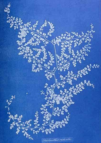
Anna Atkins was an English photographer and botanist noted for her early use of photography using cyanotypes. She was also one of the first female photographers in the world.
A cyanotype is a photographic process dating back to around the 1840s. The process was invented by sir John Herschel in 1843. Some advantages of cyanotypes:
Some Disadvantages of cyanotypes:
|


|
The first thing that i did to make my cyanotpye paper was get a piece of watercoloured paper and paint it in a solution. The solution makes the paper sensitive to UV light enabling the images to be exposed and developed. I also painted a piece of fabric in the solution making the square sensitive to uv light. I then left the paper to dry. once the paper dried we layered pieces of dried leaves over the paper. Once I did this the paper was exposed to UV light the leaves block the UV light creating a silhouette of the image. once the paper had been exposed we washed it in the sink with water to remove any yellow tints.
i think my most successful image was the upper middle image with the fern silhouette i like this because of the pattern made and the change from dark blue to a lighter blue. If I was to do another lesson I would choose to do a larger version of my negative and to make the image more central. |
Abstraction through Photograms / Man Ray

Disadvantages of photograms:
|
Man Ray was an artist during the 20th century, he contributed to the Dada and Surrealist movements. He produced a variety of work with a range of media, however he considered himself a painter. He is also noted for his work with photograms, which he called "rayographs" named after himself.
A photogram is a photographic image made on paper without the use of a negative or camera. It is made by placing objects between light-sensitive paper or film and a light source. Advantages of photograms:
|

|

|

|
Dark Room:


Photograms are a form of creating images without the use of a digital camera to produce them you need to us a dark room, like the images above. Objects are placed onto a light sensitive photographic paper and then exposed to light in a darkroom. The paper is then developed by using light-sensitive chemicals in the darkroom.


Technical Processes/ High Key Photography
|
High key photography is a genre involving a pure white background plus a detailed (but not overexposed) subject.
It’s produced by using a background that’s far brighter than your subject—while still exposing for your subject. Unlike low key photography, drama and intensity is not the intention of the high key genre. It alternatively attempts to convey a positive- upbeat or happy aura. High key photographs have minimal tonal range and lack deep contrast caused by harsh shadows. Furthermore the overall colour palette is light. |


Equipment Used
Right to Left:
LED Light, Macro Lens, Perspex, Receiver, Remote Flash, DSLR Camera
LED Light, Macro Lens, Perspex, Receiver, Remote Flash, DSLR Camera


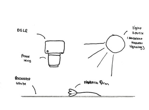
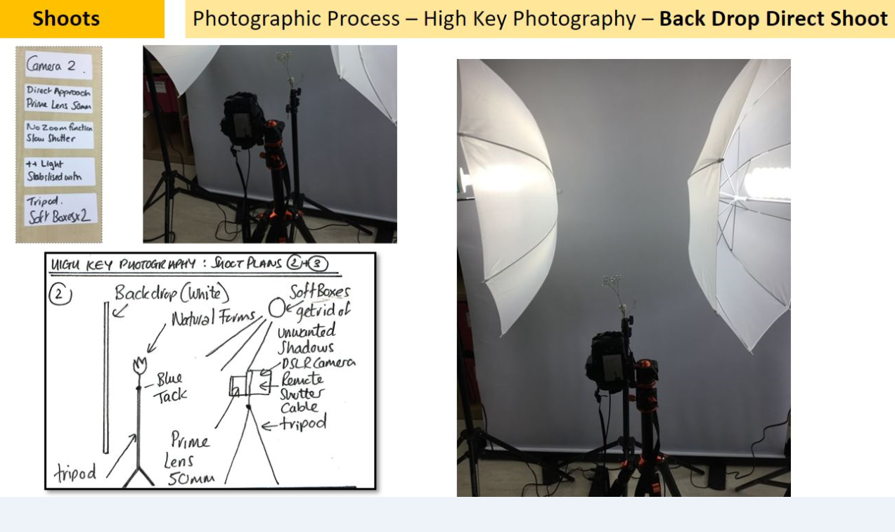
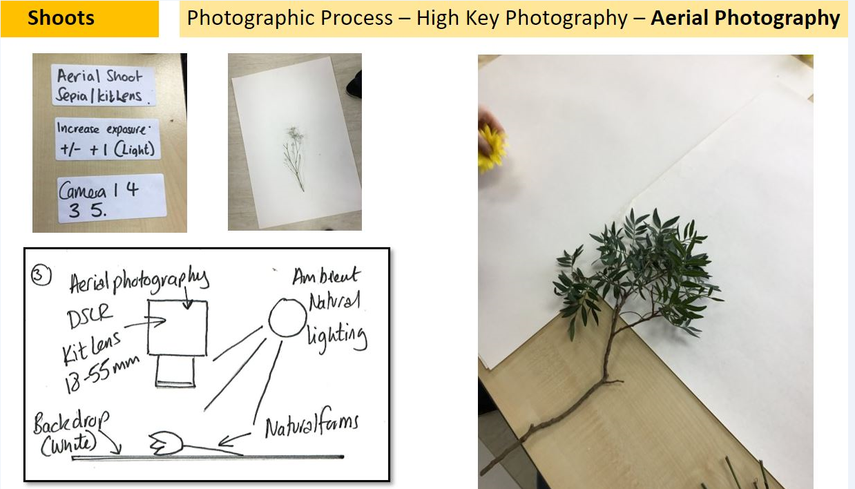
Shoot Plan Diagram

|

|
|
This shoot was inspired by Karl blossfeldt as I have been studying the way he creates abstracted from nature and I was very keen to emulate his style. The shoot will take place in the classroom because I can control the lighting better and can set up 3 shoots to experiment with the high-key photography technique. The props used will be natural forms such as seed heads and shells because these were commonly seen in Blossfeldt's work and provide good amounts of texture, line and from. I will also use a white backdrop in all shoots. I will shoot in high-key for my images using a combination of soft boxes, remote flash, Perspex diffusers and natural ambient light. I will need to control the lighting to avoid shadows and distance my subject matter away from the backdrop.
I will use the school camera (DSLR 4000d / Prime lens 50mm / Macro lens ) and my own camera which will be a canon 2000d / kit lens 18-55mm I intend to shoot in sepia (picture styles setting) to give an aged look to the photoshoot. In all of 3 of the shoots I will aim to use a slower shutter speed to let more light into the camera lens but will stabilise the camera with a tripod/books so finer details can be captured.
I will use the school camera (DSLR 4000d / Prime lens 50mm / Macro lens ) and my own camera which will be a canon 2000d / kit lens 18-55mm I intend to shoot in sepia (picture styles setting) to give an aged look to the photoshoot. In all of 3 of the shoots I will aim to use a slower shutter speed to let more light into the camera lens but will stabilise the camera with a tripod/books so finer details can be captured.
|
|

|
Karl Blossfeldt / Artist research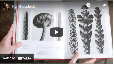
Nature educates us into beauty and inwardness and is a source of the most noble pleasure.-Karl Blossfedlt why this quote?
I have chosen this quote because I think it show Karl blossfeldt passion toward his work capturing the many forms of nature. The quote shows his appreciation for nature and how wonderful it can be if you just take a step back and admire it. |
why this artist? we have chosen this artist because his work links to our chosen topic of abstract nature his work is similar to previous artists that we have studied. His work links with the work of anna Atkins who used botanical objects for her images similarly Karl blossfeldt also uses botanical forms for his images. who is he? Karl Blossfeldt was a German photographer, sculptor, teacher and artist who worked in Berlin, Germany. He is best known for his close-up photographs of plants and living things. Karl like his father was inspired by nature which led him to complete many pieces of work relating to natural forms. why this video? I have chosen this video because it demonstrates the work of Karl blossfeldt and showcases his best pieces. It also clearly explains his work and his journey of growing as an artist. the video shows examples of his work from his book that is made up of his most famous and inspiring images. |
SEMI Analysis / Karl Blossfeldt
|
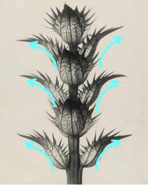
SUBJECT: my chosen photographer is Karl blossfeldt. The title of this image is Acanthus mollis 1898 -1928. The genre of this photography is still life. The props sued in this image is a flower also referred to as the natural form. Blossfeldt mainly focused on images of botanical forms, photographed against a plain often white background which shows the images in more detail. ELEMENT: The photographer uses the 7 visual elements of art to create this image. This image has examples of line, shape and texture. In my opinion the strongest elements are line, texture and pattern. In the image you can see plenty of leading lines which draws the viewers attention to different part of the image especially the flower heads. You can also see the texture/ pattern within the image the high contrast highlights the patterns with the veins in the leaves and stem. The photographer uses colour/ tone well in his work by taking the image against a white background with a light from behind, the colours highlight the shadows and the highlights within the image MEDIA: The main focal point of the image are the flower buds on the stem of the natural form. I can tell this because the leaves act as leading lines which draw the viewers eyes form the outside of the image into the middle where the stem and flower buds are. The natural form has been placed int the middle of the image an is perfectly symmetrical and means that the image is balanced. The image has been taken on eye level with the natural form. I believe this photo has been taken with natural light because the lighting is spread out within the image and isn’t concentrated to any part of the image. However the photographer may have used high key lighting to light the back of the image for more detail. INTENT: I feel the photo gives a message of a slightly moody undertone. The colours blossfeldt uses are grey and dull which creates a creepy atmosphere. The abstract forms of which the images are taken give the viewer a sense of unearthly feature, the subtle ombre effect between the white grey and dark black within the image reminds me of smoke which gives an overall cold tone to the image.
|

Acanthus mollis 1898-1928


|


Karl Blossfeldt shoot


Dennis Wojtkiewicz - Artist Research

Email Quote – Direct Artist Response |
why this artist?
I have chosen Dennis wojtkiewicz as my artist because he uses many forms of nature to produce his images. This artist differs from the previous artists we have studied because he paints his images from the photographs that he has taken. who is he? Dennis wojtkiewicz (born 1956 in Chicago, Illinois), he is best known for his images of sliced fruit capturing the details within each fruit. why this video? I have chosen this video because I think it showcases wojtkiewicz work and the effort he put into creating his pieces of art. The video demonstrates wojtkiewicz use of colour and pattern and the different techniques he has used. why this quote? The quote is from a direct email response from Dennis. W himself. From the email, I was able understand how wojtkiewicz used his photography to emulate natural forms and turn them into paintings. He uses a DSLR camera with a macro lens attached. the macro lens has a low f. stop this means that the images wojtkiewicz takes will have a blurred background ,meaning the images will be in plenty of detail. |


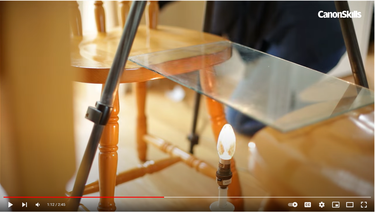
Technical Processes / Back Lighting FruitBacklighting in photography happens when the main light is behind your subject and facing the camera. Backlight photography can be challenging, if you are used to using the auto exposure modes on your camera. the main light source is place behind your primary object resulting in a detailed and glowy image.
to create backlit photography you will need the following pieces of equipment: a camera, a macro lens, a clear sheet of material like glass or plastic, a light source, a tripod, remote shutter release cable and a semi translucent fruit. |
|
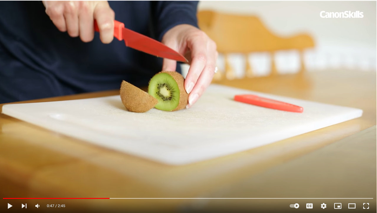
step 1:
Slice the fruit making sure that the slices are even and thin, so the colours will be bright but not over-exposed. |
Step 2:
Lay the slice on the glass / clear material, with the light source placed directly underneath the fruit |
Step 3:
Then adjust your camera settings and place on tripod, then adjust tripod so it is above the clear surface. |

Step 4:
Now, use a remote release cable to take the image to ensure that there is no unwanted camera shake. |
Shoot Plan / Dennis Wojtkiewicz

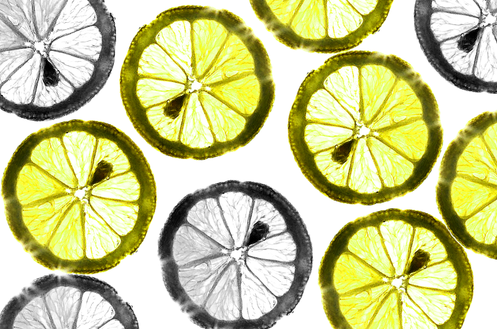
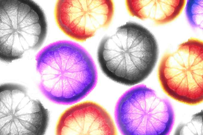
This shoot has been inspired by the paintings of Dennis Wojtkiewicz, he uses backlighting to create his images. his work features plenty of colour, this is one of my aims to emulate in my shoot. This shoot will be done indoors, this allows me to have greater control over lighting and exposure. There will be ambient light from the window however the majority will be form an artificial light source placed under a glass sheet. this surface will allow light to pass through the fruit allowing us to achieve our desired outcomes. I will use a range of fruits such as a kiwi, grapefruit, orange and lemon/lime. the fruit will be sliced thinly, so the fruit will be translucent enough to let light through. For this shoot I will be using a DSLR camera with a macro lens, i will be using this camera on a tripod to prevent any unwanted camera movement. The camera settings will: have an aperture of f/8-f/12; a low ISO allowing for better image quality and a slow shutter speed to allow more of light in the camera.
Dennis Wojtkiewicz - Contact Sheet

Dennis Wojtkiewicz - shoot images edited


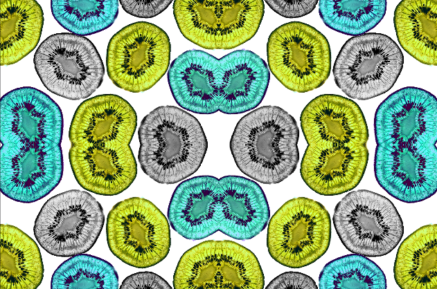
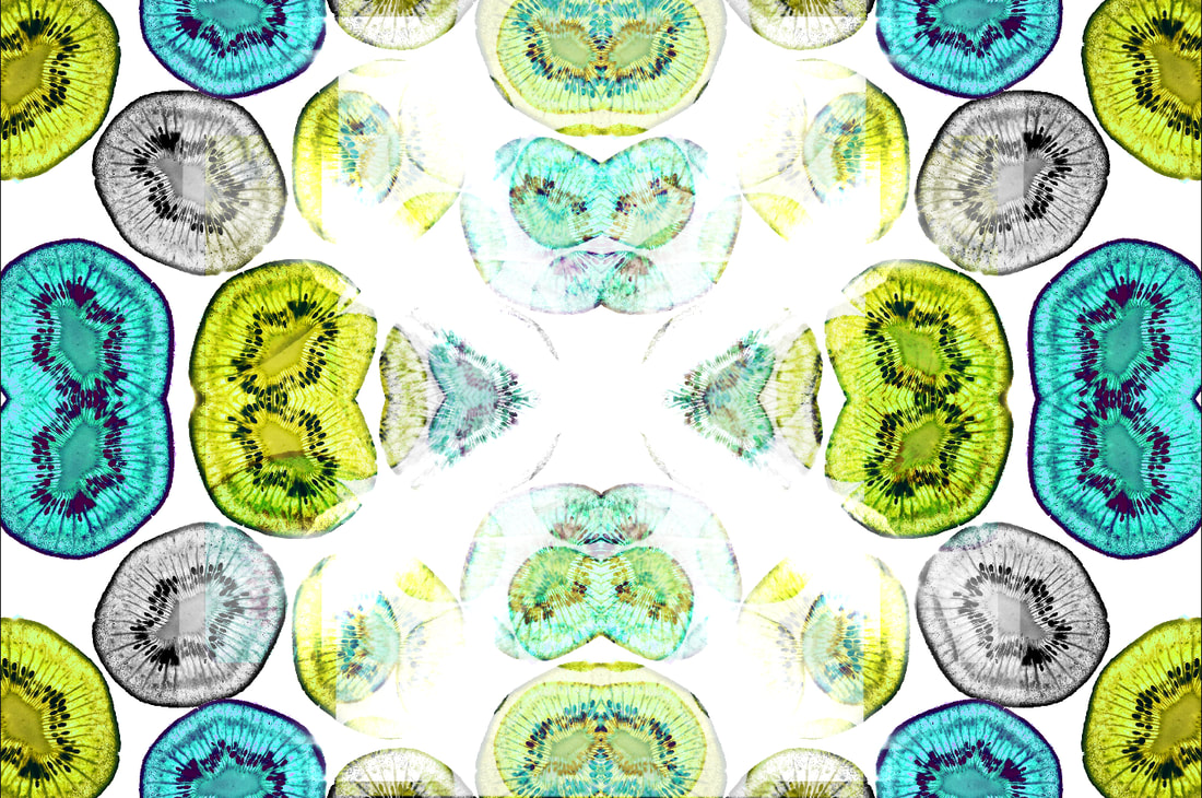
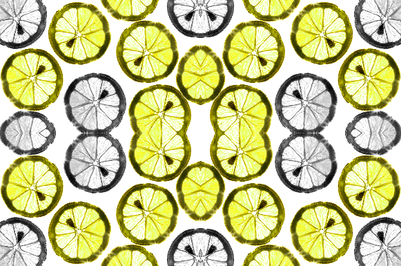
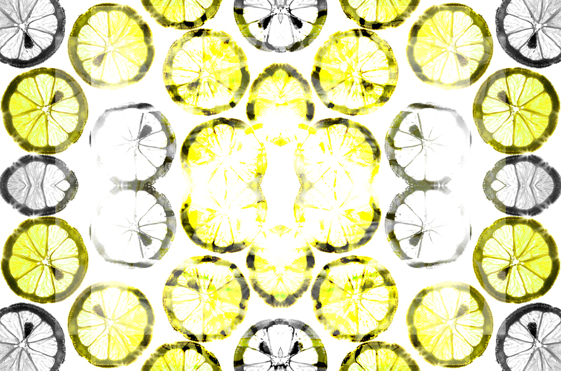
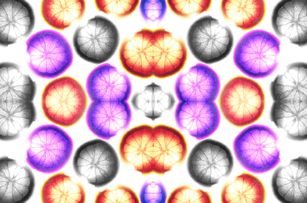
to begin my edits I firstly opened pixlr-e and downloaded one of my images. i then drew around the object and deleted the background, leaving the object on its own. I then edited the kiwi adjusting the hue and saturation I also edited the kiwi so the seeds and small fibres were more obvious. I then added in a new layer and made the background of my image white. I then duplicated my images and arranged them around the white background. Once I was happy with the arrangement I adjusted the colours of the kiwis. Once I had adjusted the colours I made them into a rotational symmetry,

|
|
|
|
|
The following images are the images that I have used for my Y10 mock exam.
|
|

Collage Processes - Year 10 Mock

Explosion Sketchbook:


Final Outcome - Year 10 Mock Exam

ABSTRACT NATURE EVALUATION:
Throughout this project I have developed my understanding of abstract photography by exploring the theme of nature. During this project I have gained an understanding into how to create different images and experiment with different techniques to create abstract and creative images. Some skills that I have gained from my abstract nature project are; intentional camera movement, shallow depth of field, monochromatic photography , low and high key photography. Theses skills have helped to further my understanding of the different types of photography.
During my abstract nature project a I have researched many different artists and their techniques to create their unique images. Each artist has photographed natural subjects in a unique and interesting way, each artists techniques differ from the other which helps to develop my knowledge around photography in the workplace.
The first artist I researched was Edward Weston, the specific piece we zoomed in on was his most popular image ‘pepper No.30’. I initially studied the work of Edward Weston due to his work relating to natural forms and abstract photography and his use of monochromatic photography to provide tone and depth in an image. After researching this photographer I learnt the use of tone, colour and contrast within a photograph, emulating Edward Weston’s work helped me to understand the different techniques involved in creating a monochromatic photography. To emulate his work we controlled the light coming onto our object without using artificial light. During our shoot we will be used natural light that cast shadows on our chosen object and create contrasts between the light and dark of the object and hopefully highlight the subject. I feel his work has helped me gain an understanding in how to highlight a subject within an image naturally, which has helped me to achieve more detailed shots.
The second artist I researched was Anna Atkins, who was an English photographer and botanist noted for her early use of photography using cyanotypes. She was also one of the first female photographers in the world. Her work was inspiring as she was one of the first female photographers of her time, this inspired me to further my research into her and discover how to emulate her work. I learnt through this research how to create a cyanotype. I enjoyed creating cyanotypes and seeing the results of the exposure.
After Anna Atkins I briefly studied the work of Man Ray, who was an artist during the 20th century, he contributed to the Dada and Surrealist movements. He produced a variety of work with a range of media, however he considered himself a painter. He is also noted for his work with photograms, which he called "rayographs" named after himself. Through researching this artist I discovered more ways to produce abstract prints in less conventional ways.
Furthering my artist research, I went on to study Horst P. Horst, who was a Fashion photographer, who used rotational symmetry to create new patterns. His book, Patterns from Nature (1946), has inspired me to create my own series of rotational symmetry patterns. Through emulating his work I learnt how to create texture and depth through the editing process of images. This way of editing images in photographer creates interesting and patterned images that are more visually intriguing and interesting.
I then went on to research the photographer Karl Blossfeldt Karl Blossfeldt was a German photographer, sculptor, teacher and artist who worked in Berlin, Germany. He is best known for his close-up photographs of plants and living things. His work links to our chosen topic of abstract nature his work is similar to previous artists that we have studied. His work links with the work of anna Atkins who used botanical objects for her images. I was intrigued by Karl Blossfeldt work, I like the level of detail he captures in his images, his simplistic images portray natural forms in a monochromatic way. I found that this shoot was one of my weaker artist emulations as I struggled with the shadow’s against a white background and subject.
The Final artist I investigated was Dennis Wojtkiewicz. I was inspired by the incredible hues and colours he captures in his pieces of work. The colours within each image inspired me to research his art work further, this was when I discovered that This artist differs from the previous artists we have studied because he paints his images from the photographs that he has taken. Dennis wojtkiewicz (born 1956 in Chicago, Illinois), is best known for his images of sliced fruit capturing the details within each fruit. During the editing process of my emulations I was able to experiment with the hue and saturation levels within my images. I was also able to increase the clarity and level of detail within each images. This inspired me to become more adventurous in my editing process and has enabled me to become more confident with making the colours within my images bright. The shoot has also taught me about macro photography and how to obtain the level of detail within each segment of fruit. Macro photography enabled me to achieve a higher quality image that is more detailed.
In conclusion I believe that my most successful final outcomes were my recent dennis wojtkiewcz rotational images. These are my favourite because they have a mix of colour and black and white subjects. To achieve these outcomes I used a combination of my previous skills that I have learnt throughout my project to create the layered composition of images together. However I felt that I let myself down describing the technical processes such as what aperture to use and how to select the correct ISO in the image. I find this is an area of focus in future to better my understanding of choosing the right setting for the tailored shoot that I am doing.
